
Simplifying insurance
buying experience
Simplifying insurance
buying experience
Redesigning the full experience, ditto purchase journey
for web and mobile responsiveness.
Redesigning the full experience, ditto purchase journey
for web and mobile responsiveness.
Simplifying insurance buying experience
Simplifying insurance buying experience
Simplifying insurance buying experience


95% seamless user journey
95% seamless user journey
95% seamless user journey


Ag
Ag
Ag
text/2xl/semibold
text/2xl/semibold
text/2xl/semibold
Design system
Design system
Design system
82% sale completion
82% sale completion
82% sale completion


Easy to digest
Easy to digest
Easy to digest

Who can be a Nominee? of the
people
Who can be a Nominee? of the
people
Who can be a Nominee? of the
people
Cased on the age and location Te recommended this ₹10L.
Cased on the age and location Te recommended this ₹10L.
Cased on the age and location Te recommended this ₹10L.

Coverage of ₹5 lakh is insufficient to meet all potential needs.
Coverage of ₹5 lakh is insufficient to meet all potential needs.
Coverage of ₹5 lakh is insufficient to meet all potential needs.
Based on the age and location we recommended this ₹10L.
Based on the age and location we recommended this ₹10L.
Based on the age and location we recommended this ₹10L.

Coverage of ₹5 lakh is insufficient to meet all potential needs.
Coverage of ₹5 lakh is insufficient to meet all potential needs.
Coverage of ₹5 lakh is insufficient to meet all potential needs.
Based on the age and location we recommended this ₹10L.
Based on the age and location we recommended this ₹10L.
Based on the age and location we recommended this ₹10L.
Guidance on every steps
Guidance on every steps
Guidance on every steps
Introduction
Introduction
As a Senior Product designer, I had the opportunity to work on this project, which involved redesigning the full experience of the insurance purchase journey.
As a Senior Product designer, I had the opportunity to work on this project, which involved redesigning the full experience of the insurance purchase journey.
Ditto has roughly more than 1000 customers per week for both term and health insurance across both Web and Mobile. Due to its complex flow and steps throughout the journey, Ditto advisors usually schedule a separate purchase walkthrough call with the customer all the time.
Ditto has roughly more than 1000 customers per week for both term and health insurance across both Web and Mobile. Due to its complex flow and steps throughout the journey, Ditto advisors usually schedule a separate purchase walkthrough call with the customer all the time.
Role
Senior Product
Designer
Years
2019 - 2022
Platform
Web, Mobile
Scope
UI/UX Design, Prototyping,
Design system
Context
Context
What is the Ditto Purchase journey?
What is the Ditto Purchase journey?
After getting the insurance advice from the Ditto advisor team, the user goes through this separate process purchase journey flow, where they give their information and select policy plans based on their needs.
After getting the insurance advice from the Ditto advisor team, the user goes through this separate process purchase journey flow, where they give their information and select policy plans based on their needs.
Main Problems
Main Problems
Users struggle with the unstructured purchase flow without clear direction on what they are going through, and a good supporting guide for the important steps. Poor user experience and low discoverability which is leading to a higher drop in users in the journey.
Users struggle with the unstructured purchase flow without clear direction on what they are going through, and a good supporting guide for the important steps. Poor user experience and low discoverability which is leading to a higher drop in users in the journey.
Today’s Purchase journey. Users feel overwhelmed or confused when filling out health insurance forms. There is a lack of clarity in coverage details, member selection, and quote generation steps. Drop-offs are observed on the members’ page
Today’s Purchase journey. Users feel overwhelmed or confused when filling out health insurance forms. There is a lack of clarity in coverage details, member selection, and quote generation steps. Drop-offs are observed on the members’ page
Current Ditto Purchase Journey Screens
Current Ditto Purchase Journey Screens


Research
Research
In my research, I discovered that the experience was lacking in many core features that can potentially increase the ease of the purchase journey for both selecting a policy premium and filling proposal form steps.
In my research, I discovered that the experience was lacking in many core features that can potentially increase the ease of the purchase journey for both selecting a policy premium and filling proposal form steps.
The top issues revolved around the purchase journey,
The top issues revolved around the purchase journey,
Quote journey.
I found that users find it difficult to give their basic information and select the perfect cover amount, add-ons, and policy periods.
Discoverability was not effective, as the users tested did not know the importance of the information they were adding, which has a major impact on the cover amount recommendation and premium pricing.
It also doesn’t have digestible insurance plan details, along with the steps, and while selecting add-ons & policy periods.
Proposal form journey.
This is the most complex steps where the user need to add more personal information and which have major changes of the rejection of the policy.
There is no proper navigation for each proposal step, and clear step guidance for the user.
The user needs to fill out the entire proposal form in a single session without any resume application options.
Spotted problems both on the Quote and Proposal form
Spotted problems both on the Quote
and Proposal form

Hypothesis
Hypothesis
Based on my research findings, I formed a set of hypotheses focused on simplifying the quote journey for better comprehension. Providing transparent, digestible insurance plan details with proper guidance on important steps in the journey.
Based on my research findings, I formed a set of hypotheses focused on simplifying the quote journey for better comprehension. Providing transparent, digestible insurance plan details with proper guidance on important steps in the journey.
Solution breakdown
Solution breakdown
The perfect solution isn't always the most feasible one, especially when faced with technical constraints and deadlines.
The perfect solution isn't always the most feasible one, especially when faced with technical constraints and deadlines.
Iterating on this complex journey with the policy quote and proposal form. I focused on key functional needs and fit for this complete journey.
Iterating on this complex journey with the policy quote and proposal form. I focused on key functional needs and fit for this complete journey.
Step 01: Improving the user interaction experience.
Step 01: Improving the user interaction experience.
The previous version of the journey had few affordances to indicate to the user about the policy they have selected and what details they need to provide during this policy quote journey. Additionally, the metadata was scattered around in a messy layout, which made the experience visually jarring and inconsistent
The previous version of the journey had few affordances to indicate to the user about the policy they have selected and what details they need to provide during this policy quote journey. Additionally, the metadata was scattered around in a messy layout, which made the experience visually jarring and inconsistent
Maintained inputs on the right side & left for policy overview
Maintained inputs on the right side
& left for policy overview

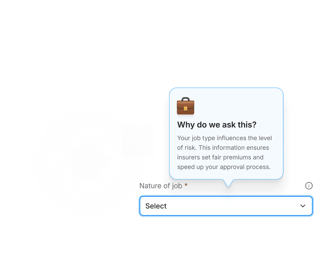
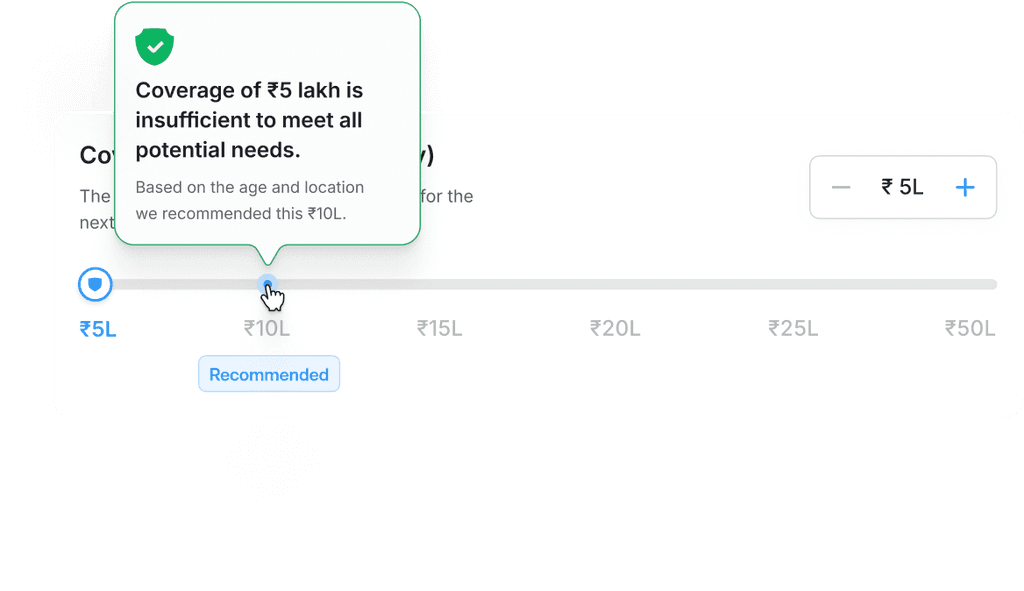
Step 02: Creating a richer support, guidance, and recommendation message.
Step 02: Creating a richer support, guidance, and recommendation message.
I have created multiple components to enhance the customer journey by adding,
I have created multiple components to enhance the customer journey by adding,
#1. Supporting message (Semantic colors)- this component helps the user to understand all the states of the information they have added.
#2. Guidance popover message (Blue color) - Which guides the user to understand the need for the information and how it will affect the policy premium.
#3. Recommendation popover message (Green color)- This component is used for recommending the best add-ons and cover for the user
0.1 Supporting message: based on the user informations
and well maintained semantics
0.1 Supporting message: based on the user
informations and well maintained semantics
0.2 Guidance popover: for important information
and how it will impact the policy premium
0.2 Guidance popover: for important information
& how it will impact the policy premium
0.3 Recommendation Popover: Ditto side
recommendations for better policy selection
0.3 Recommendation Popover: Ditto side
recommendations for better policy selection
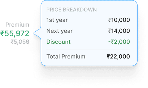
Step 03: I designed easily digestible insurance plan details
Step 03: I designed easily digestible insurance plan details
Tried multiple layouts for this digestible insurance plan because this one needs to be perfect in the entire process of the quote journey.
Tried multiple layouts for this digestible insurance plan because this one needs to be perfect in the entire process of the quote journey.
0.1 Policy details
0.1 Policy details
0.2 Add-on selection
0.2 Add-on selection
0.3 Payment conditions
0.3 Payment conditions
0.4 Active policy state
0.4 Active policy state

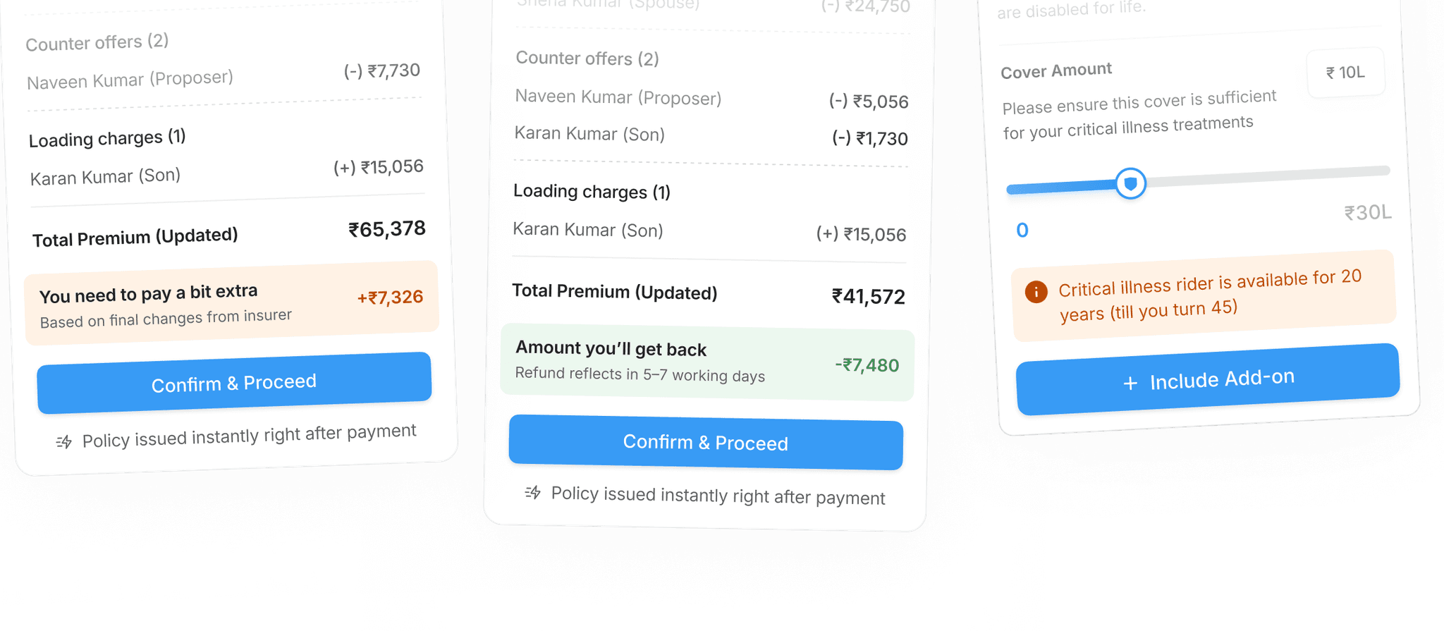
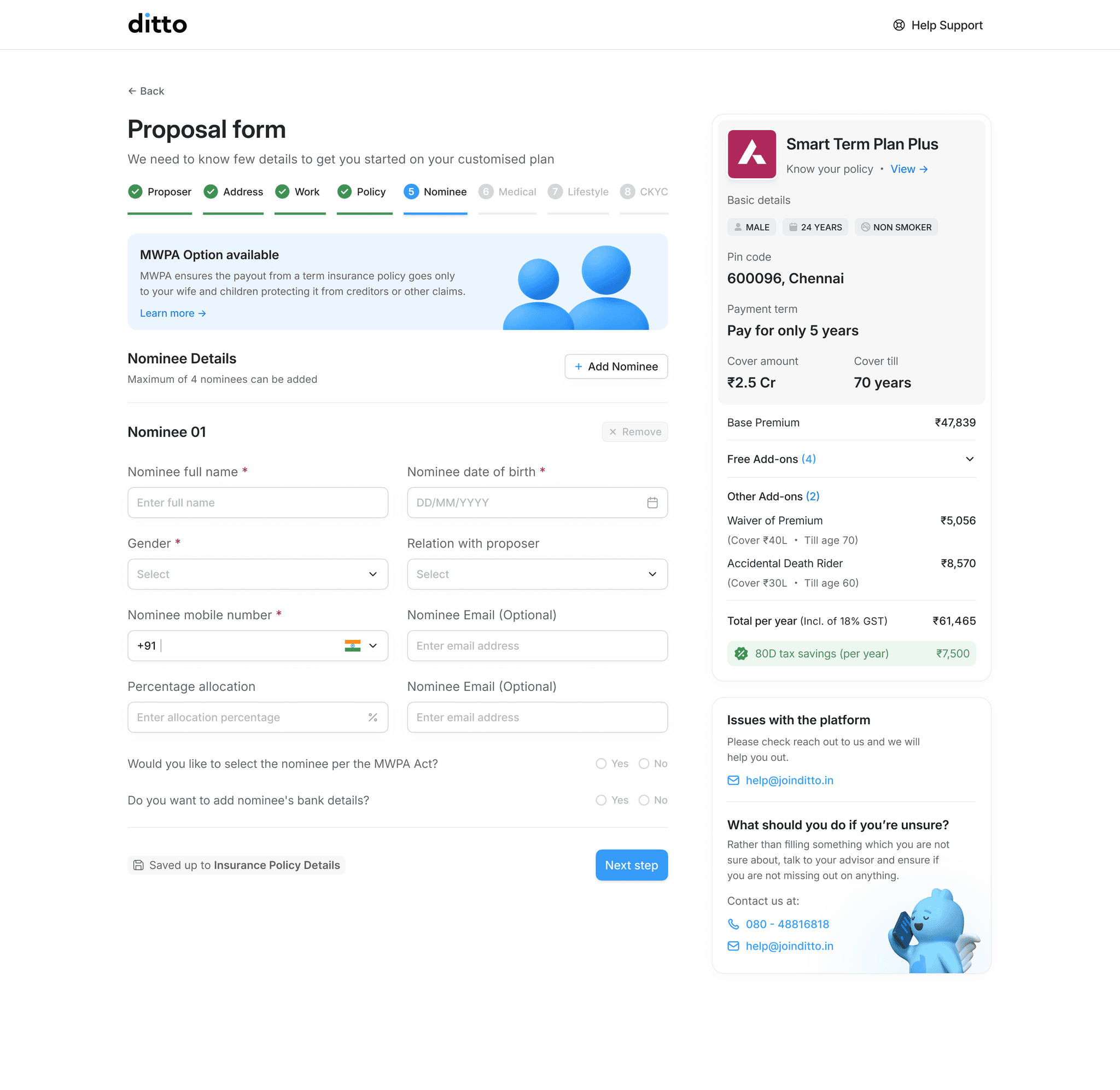
Step:04: Introduced new resume application anytime with last resumed checkpoint.
Step:04: Introduced new resume application anytime with last resumed checkpoint.
User needs to fill out the entire proposal form in a single session without any resume application options. So this resume anytime option will help user to continue their proposal form without pushing to complete at one time.
User needs to fill out the entire proposal form in a single session without any resume application options. So this resume anytime option will help user to continue their proposal form without pushing to complete at one time.
Maintained inputs on the right side & left for policy overview
Maintained inputs on the right side &
left for policy overview
Retrospective
Retrospective
This is improved version is under the testing process with more than 95% seamless user journey with 82% sale completion. I’m proud of the progress and impact I made in this project.
This is improved version is under the testing process with more than 95% seamless user journey with 82% sale completion. I’m proud of the progress and impact I made in this project.
The experience taught me how to adapt quickly and better scope complex product work for my future projects.
The experience taught me how to adapt quickly and better scope complex product work for my future projects.
#1 Adapting to change
#1 Adapting to change
When the project was deprioritized, I quickly shifted gears and focused on completing production-ready designs so the work could move forward when needed. This experience taught me the value of staying flexible and making the most of changing circumstances
When the project was deprioritized, I quickly shifted gears and focused on completing production-ready designs so the work could move forward when needed. This experience taught me the value of staying flexible and making the most of changing circumstances
#2 Breaking down complex product challenges and scoping for the future
#2 Breaking down complex product challenges and scoping for the future
When the project was deprioritized, I quickly shifted gears and focused on completing production-ready designs so the work could move forward when needed. This experience taught me the value of staying flexible and making the most of changing circumstances
When the project was deprioritized, I quickly shifted gears and focused on completing production-ready designs so the work could move forward when needed. This experience taught me the value of staying flexible and making the most of changing circumstances


